![]() I recently created a logo and some branding materials for KYN, a business incubator. KYN wanted their logo to have more of a human touch then most tech/startup logos out there so it has some texture added and uses a bright vibrant orange as their primary color balanced by earthy tones.
I recently created a logo and some branding materials for KYN, a business incubator. KYN wanted their logo to have more of a human touch then most tech/startup logos out there so it has some texture added and uses a bright vibrant orange as their primary color balanced by earthy tones.
LPS' Information Exchange 2013 - Decades of Distinction
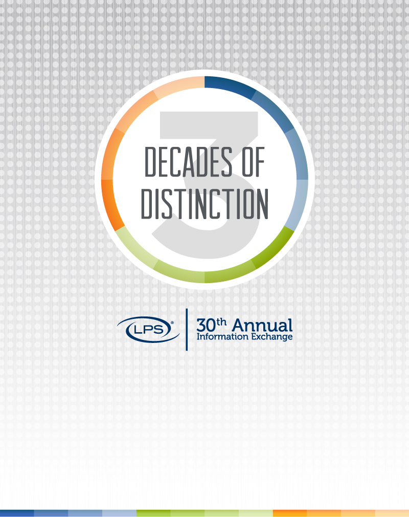
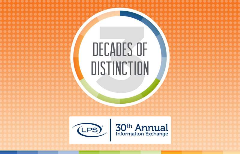
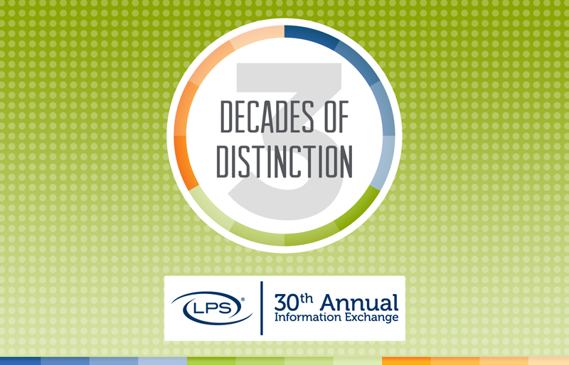
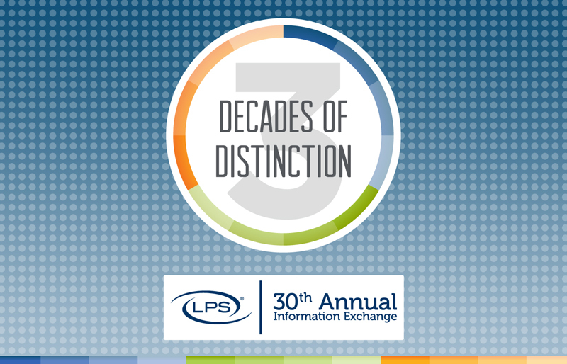
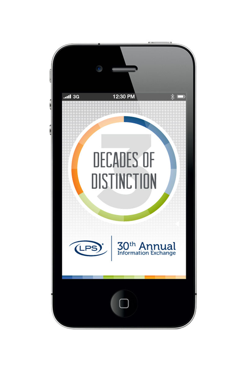
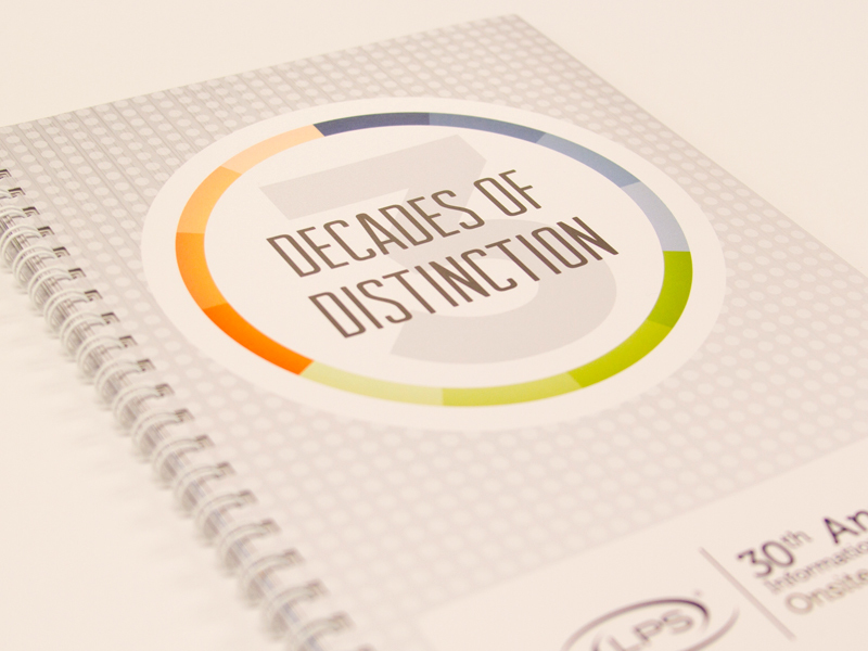
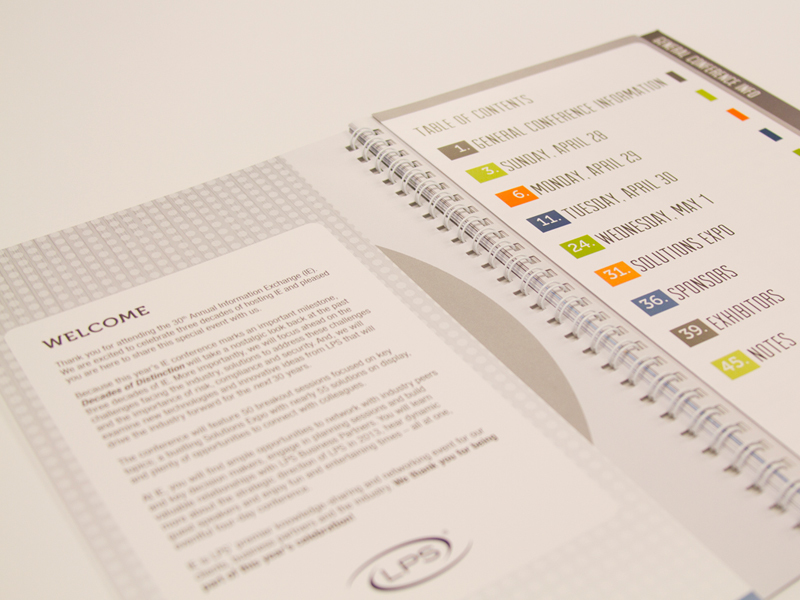
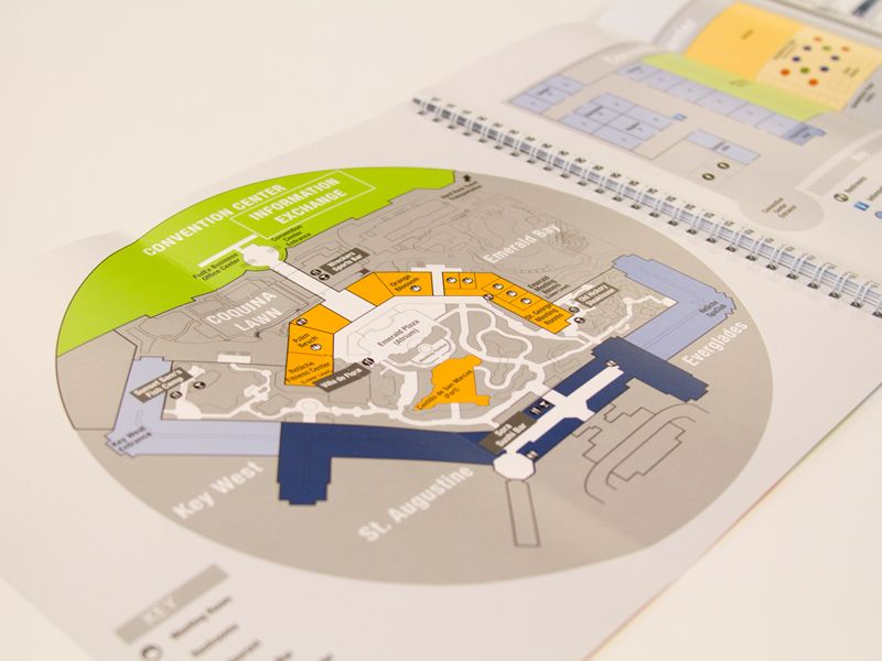
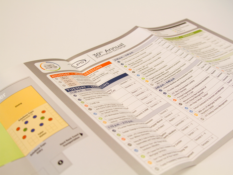
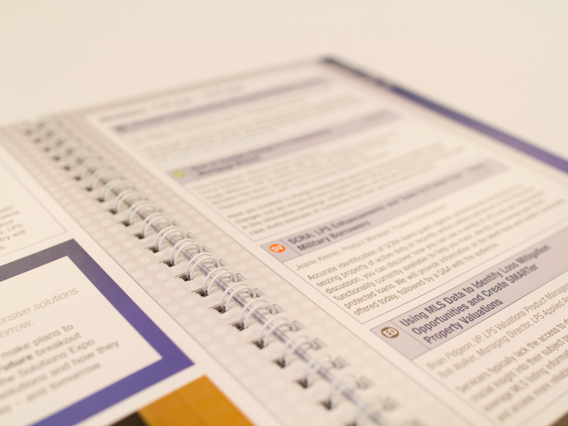
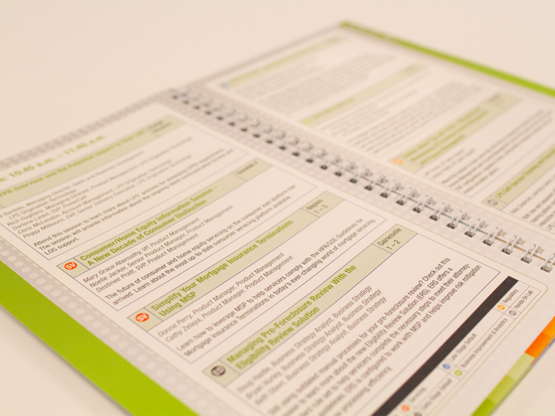
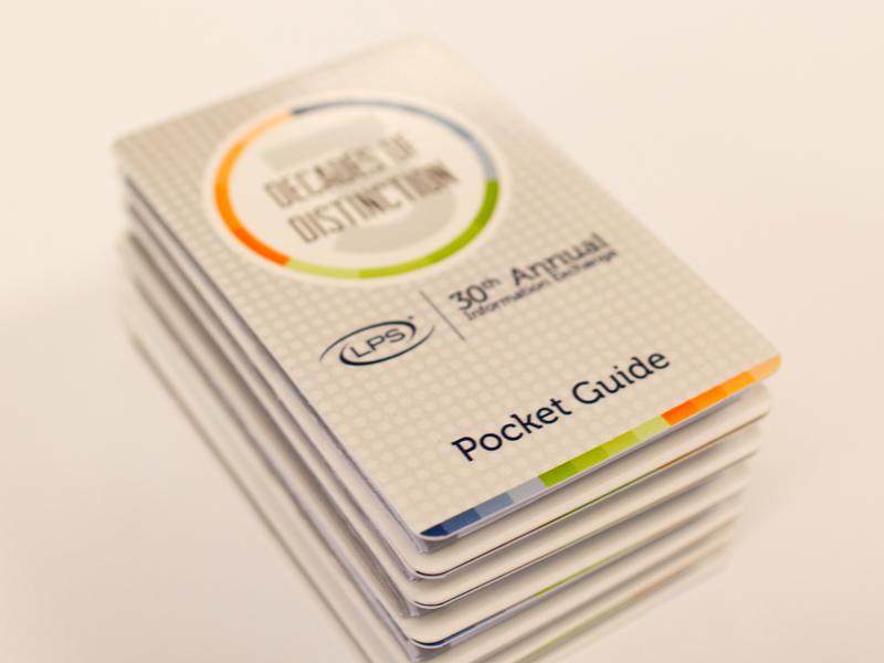
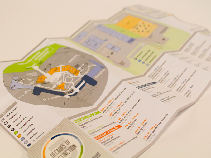
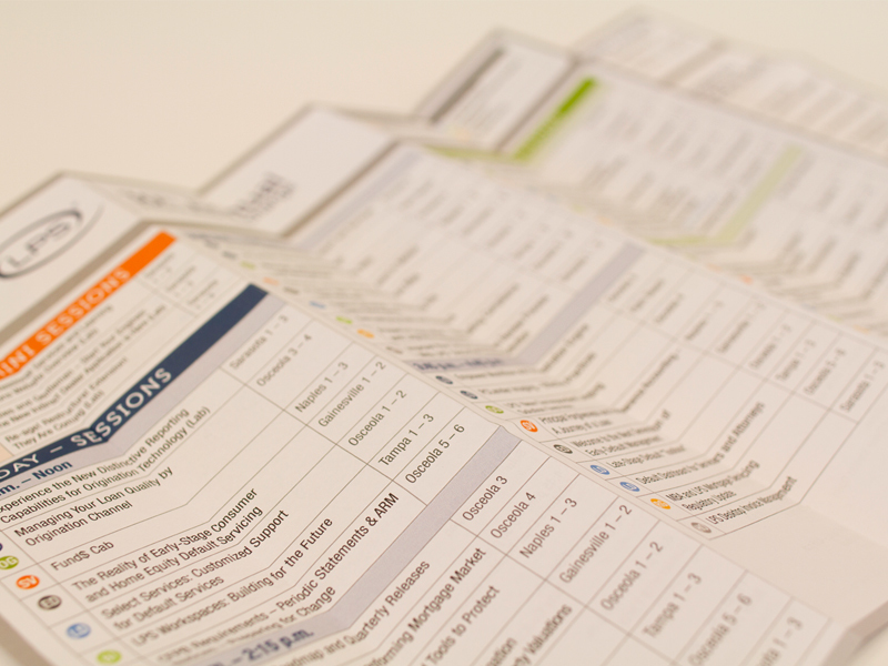
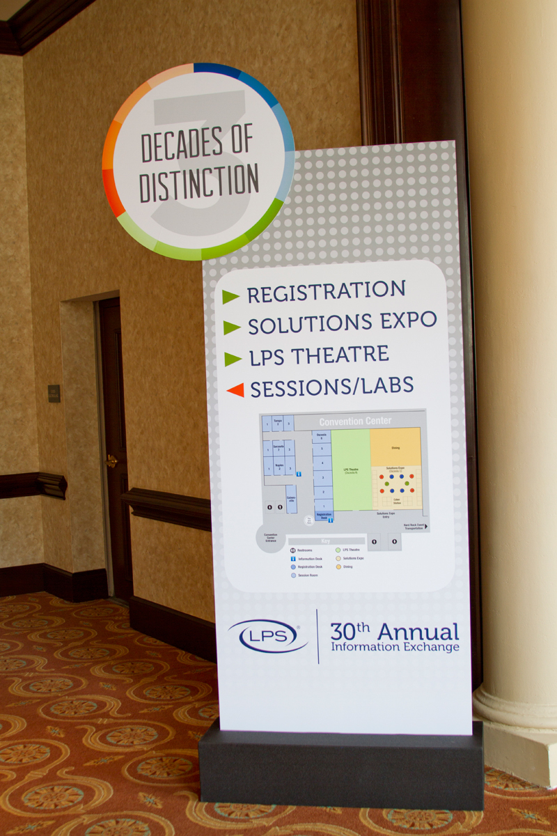
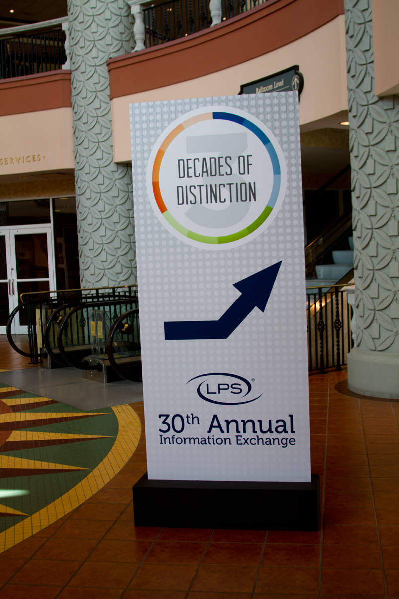
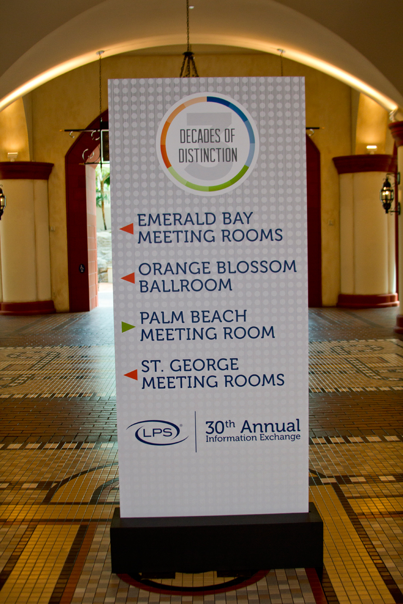
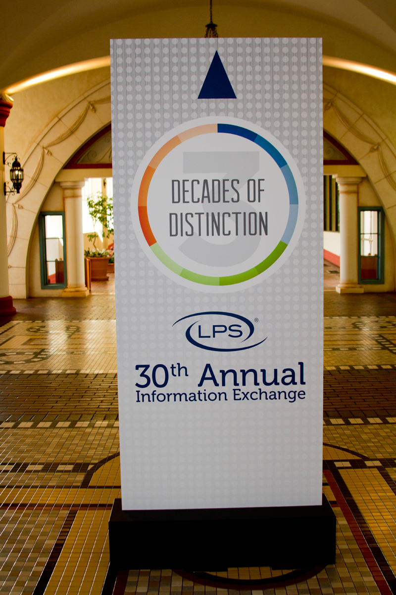
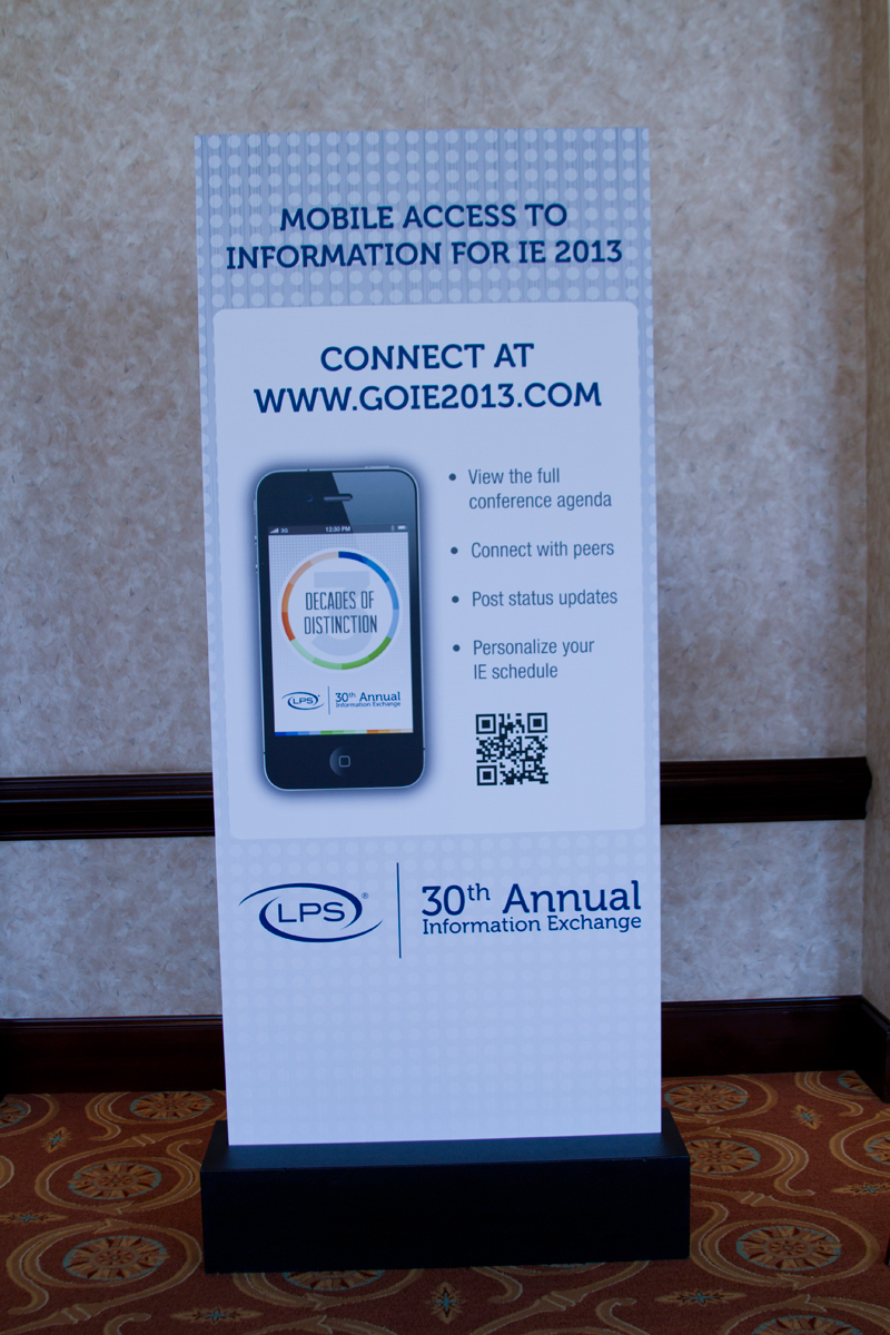
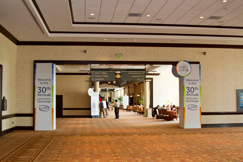
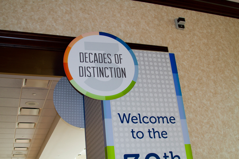
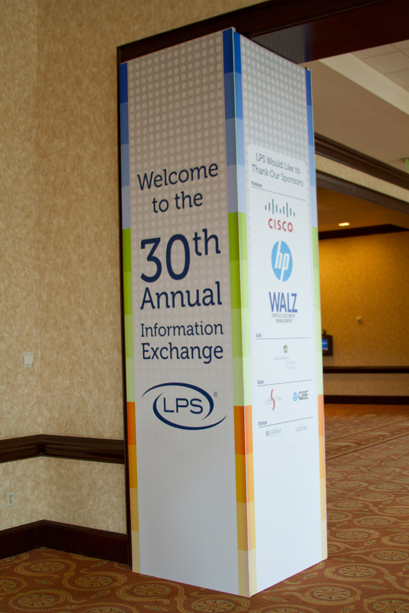
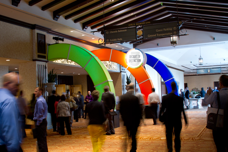
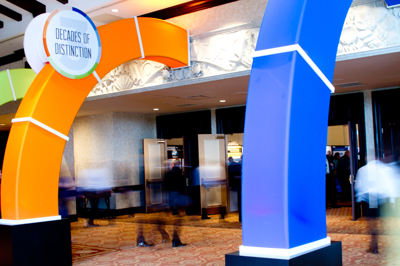
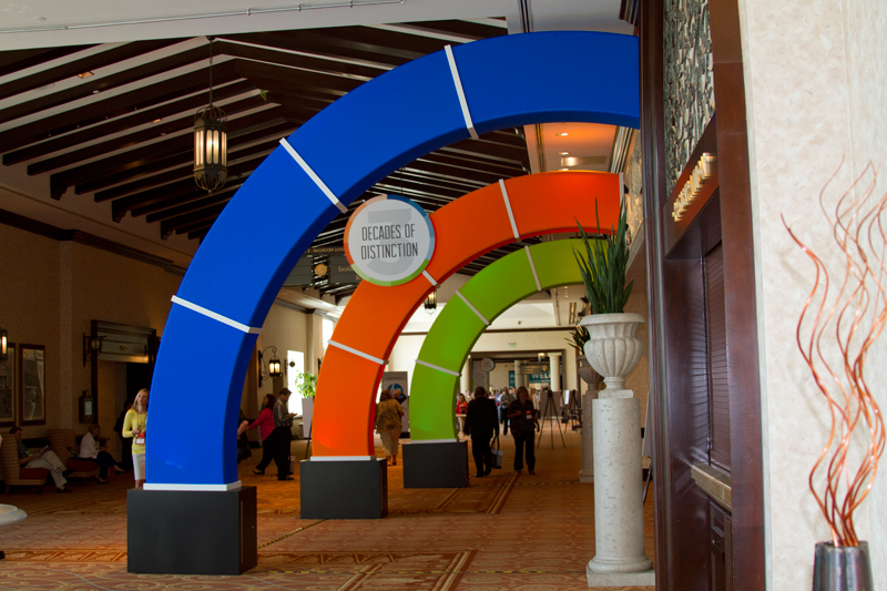
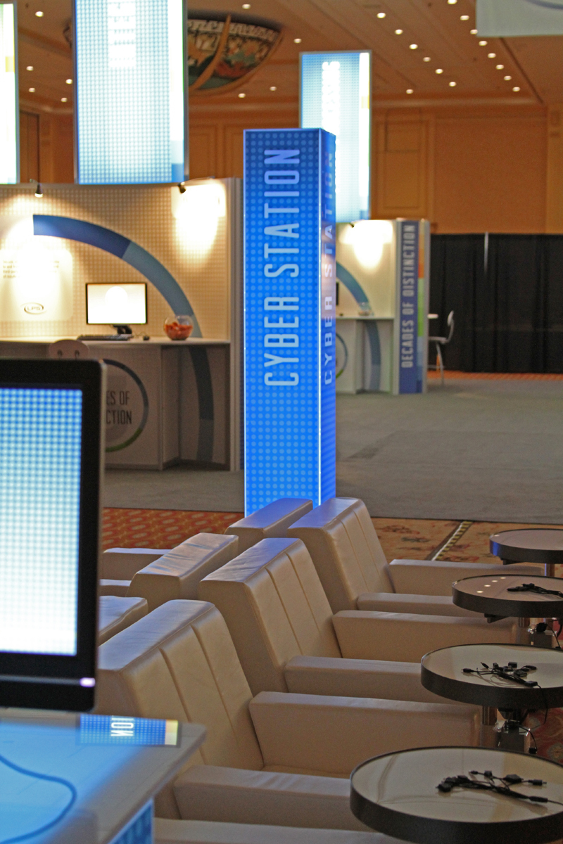
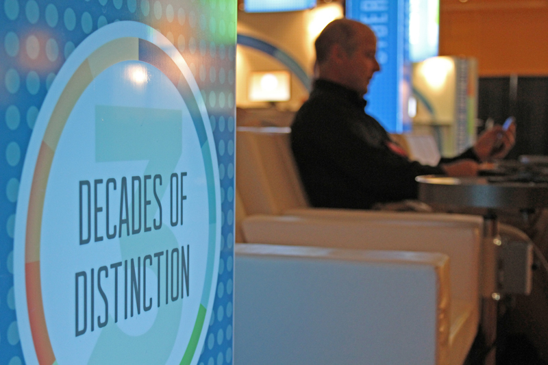
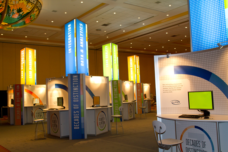

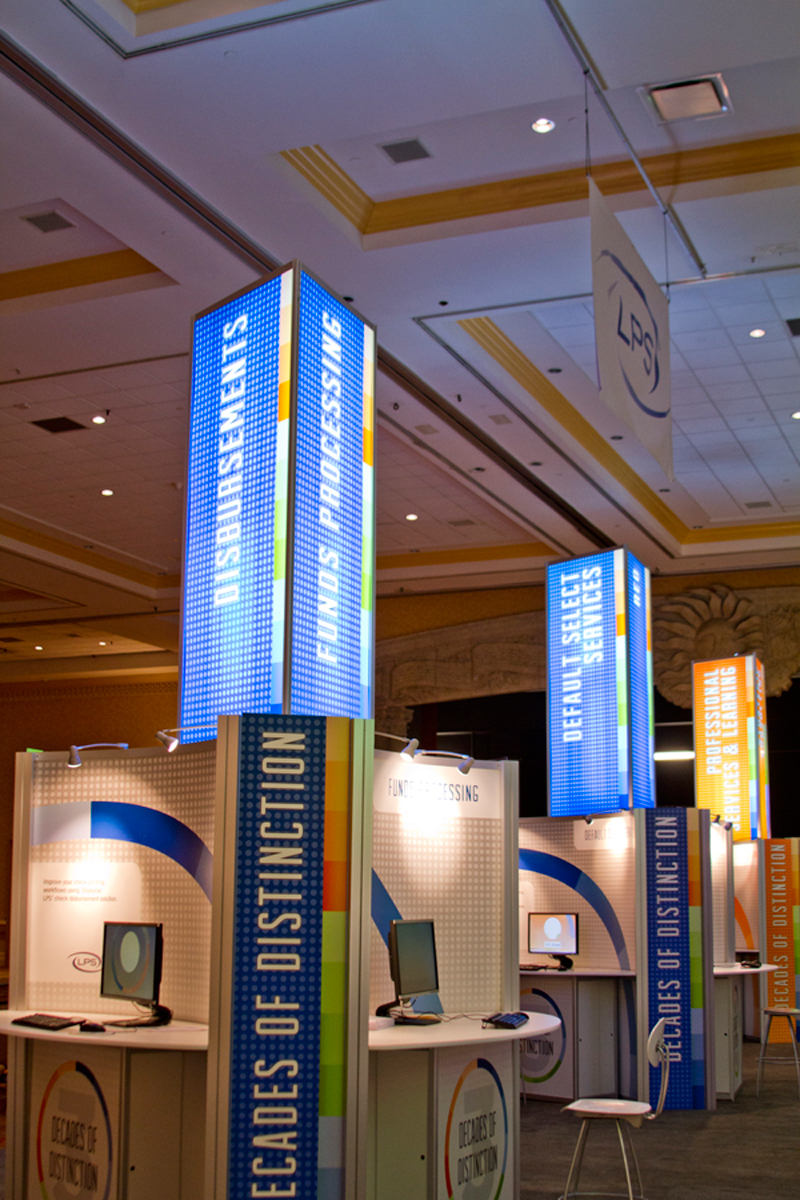
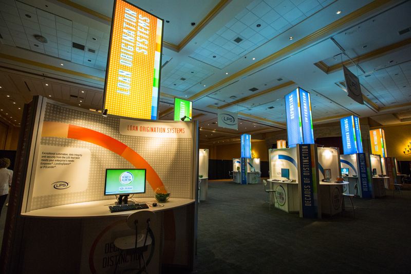
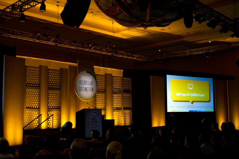

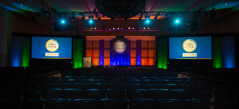
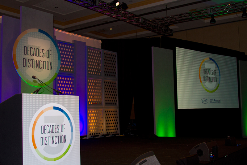
LPS' 30th Annual Information recently celebrated a milestone, 30 years of presenting their annual Client Conference themed Decades of Distinction. My concept was chosen and I was tasked with designing and branding the entire conference to engage clients and promote the companies products and solutions.
This was a very large and intensive project that required a broad scope of branding that covered everything from an onsite guide, pocket guide, entry way signage, kiosks, pods, promo items and multimedia as well.
Grilled Cheese Bandits
![]() I just finished creating this logo for Grilled Cheese Bandits, a gourmet grilled cheese food truck out in San Francisco. This was a really fun logo to work on and the owners of the company are two awesome guys, one is an old school punk rocker and the other is a metal head (my kind of people). They wanted their logo to have a western bandit/outlaw look and feel without being too cheesy... sorry I had to go there. This logo is also for a food truck so I wanted it to be simple and bold so it would be easy to read and recognizable from a distance. I also went with a bright color scheme to make this logo really pop. In all this was one of those great logo projects that are a blast to work on, and if you find yourself in SF, get a grilled cheese sandwich from these guys.
I just finished creating this logo for Grilled Cheese Bandits, a gourmet grilled cheese food truck out in San Francisco. This was a really fun logo to work on and the owners of the company are two awesome guys, one is an old school punk rocker and the other is a metal head (my kind of people). They wanted their logo to have a western bandit/outlaw look and feel without being too cheesy... sorry I had to go there. This logo is also for a food truck so I wanted it to be simple and bold so it would be easy to read and recognizable from a distance. I also went with a bright color scheme to make this logo really pop. In all this was one of those great logo projects that are a blast to work on, and if you find yourself in SF, get a grilled cheese sandwich from these guys.
Springfield Disc Golf Course


I recently had the opportunity to work with an old art director of mine, Andre Macris. He asked for some help on a project in his historic neighborhood of Springfield. It turns out a disc golf course was being built at Klutho Park and they needed a logo. Klutho Park which was created between 1899 and 1901 is a really cool historic park in Jacksonville and I always like to work on projects in the local community so I jumped on board. What I originally thought would be a logo project turned into an overall branding campaing for the Springfield Disc Golf Course which included a logo, welcome sign, score cards and tee signs.
Beginning with the logo, I knew that the park is historic and very iconic to a lot of locals so I made sure to pay repect to the classic stylings and designs that still remain, especially the balustrades which are incorporated into the bottom portion of the logo. The type I used for "Springfield" mimicked some old carved signage above many of the bridges crossing Hogans Creek which runs along the park. I also included a disc golf basket with the number 18 to let people know that it was an 18 hole course. I also wanted to keep the logo circular so it could easily be printed onto discs.
Once that was wrapped up I moved onto creating a welcome sign which included a map, rules, hole info and a few other bit of info for players. In addition, I created a score card so players can keep track of their scores. In all this turned out to be a large project with large and small elements designed to pay respect to the historic park but be fresh enough to grab peoples attention and inform them on the game of disc golf.